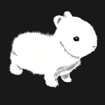
“Oh my god! I love it! (Pause) What is it? A… guinea pig?”

Not to dispel the potential for a compelling mystery, but what it is… is this:

A dwarf rabbit.
Why? I won’t say it’s complicated, but it has its layers.
Firstly… why not?
Do you see it? Are you looking at it?! Did you know that this is a thing?! That exists?! Look at it!
The moment I saw this image, I knew I wanted to use it in some capacity, even if just as a one off design. Partly because it’s the cutest f***ing thing you’ve ever seen, and partly because branding for anything and everything, much less the bike industry, is just insane (inane?) these days.
I mean, remember when churches were just the name of whatever town they were in or the road they were on, coupled with some simultaneously mundane and absurd iteration of whatever side of the same coin they subscribed to: Moorestown Progressive Baptist, or Youngsville Primitive Methodist. Now they’re called IGNITE! or ELEVATE! or FIRESTORM! But skinny jeans or not, it’s all still just Reformed Southern Orthodox Presbyterian or whatever. Goody Proctor is a witch!
(FYI, those are also the three most popular names for physical therapy establishments and/or crossfit gyms these days.)
Bike shops are barely different. Sure, there are some holdouts: Grand Rapids Bicycle Co., Atlanta Cycling, Ken’s Bike Shop. But now we’re Revolution, Angry Catfish, Loose Nuts, Halcyon, Super Corsa, District, Transit, Kindred, Opalescent, Analcunt.
Meanwhile, none of us will ever be Marty’s Reliable. (RIP, my dude)

Branding. I hate it. I mean, I genuinely love the creative process and getting to throw ideas against a wall. But I hate the nature of it. Freezing a brief frame of our ever fluid growth and personality into some static icon of our being. One that defines us for the entirety of whatever “brand” we happen to create.
Sure, “Patagonia” is timeless. But Piggly Wiggly probably has a few marketing challenges.
And REVOLUTION is fine and great, but I think about changing the name ALL THE TIME.
If I could, I’d change the name of the shop every year and come up with all new logos and ideas and iconography.
For instance, in 2025, I’d love to be SNAKE RIVER CYCLES, and have a queer/wild west theme; install some swinging saloon doors and politely greet anyone and everyone who comes in as “ma’am” with a chivalrous tip of our cowboy hat. (Nevermind that there are no rivers in Greensboro, and while snakes abound, they factor very little into daily life around here.)
In 2026 maybe I’d get rid of the bar (or at least just serve Kombucha) and become the straight-edge themed X-EARTHCYCLE-X.” And sure, we won’t drink anymore, but we promise to have just as many interpersonal problems as ever. If you aren’t now, you never were. STRAIGHT! EDGE!
And in 2027 we’re going to be MOUNT OLIVE PRIMITIVE FREE WILL BICYCLE SHOP and have a little marquis out front that we change every week to say things like “bikes are worthy to be praised!” and “put bikes back in school!” Our tagline will be… you guessed it, “Goody Proctor is a witch!”
But for now? We’re Revolution Cycles. With a bunny theme. IDK.
The bunny is many things. One… as I mentioned, it’s the cutest goddamned thing you’ve ever seen. Duh.
Two… the bunny (or rabbit, (or hare, if you will)) is a classical mythological manifestation of the trickster. And well… we like tricks.

And three… it was a response to a trend in the bike marketing world to use some sort of primitive, atavistic animal as a logo. You know… because we’re so wild. Two of the most iconic probably being Team Dream Team and The Radavist.


Both great, don’t get me wrong. It’s just… us? We’re not wild. We’re the cutest f***ing thing you’ve ever seen.
And yeah… I could have run with a bunny image like this…. (and still might, who knows…)

But it’s just
not.
cute.
enough.

Anyway, now that I’d chosen an image to work with, one that had absolutely nothing to do with bikes and would only serve to confuse people, I needed to come up with an equally confounding tagline. So I started throwing things stream of consciousness against a wall….
Revolution Cycles…. Cuter Than You.
Revolution Cycles… Full of Rage.
Revolution Cycles… Hotter Than We Look.
Revolution Cycles… Probably Great.
Revolution Cycles… Bikes Are Dumb.
Revolution Cycles… Forget Your Life.
Revolution Cycles…. In Love With Your Wife.
Revolution Cycles… The Void Beckons.
Revolution Cycles… We Hate Money.
Revolution Cycles… Serf’s Up!
Revolution Cycles… Our Brand Could Be Your Life.
Revolution Cycles… Chop Local.
And so on… And so on…. And so on…
Until “Revolution Cycles… Not A Cult.”
While I do have my moments of singular creativity, most of it is just passively or actively stolen from a million sources and influences… whether I like to think I pulled it out of thin air or not. I sometimes wonder if people think NOT A CULT was taken from the now defunct VELO CULT bike shop out of Portland. Certainly they were my inspiration in bringing beer sales into the shop, and while I would LOVE to rip off every aspect of what they did,….
That wasn’t it.
NOT A CULT was my stolen homage to one of the least known but best live bands that ever existed.
A band who is “worthy to be praised.”
The Causey Way.

And I have to say, it’s a pretty solid pairing.

While not likely, I suppose that one day it’s not impossible that the owner of the bunny pic we tweaked into a temporary logo will come knocking, and either ask for their stake in the tens of dollars we’ve made on merchandise or demand that I cease and desist.
At which point I’ll just collapse into their arms and whisper wetly into their shoulder. “It’s over. It’s finally over.”
But also, we’re not a cult. Why? Who told you that? Was it Steve, perchance?
“So… what’s the deal with the all the knife imagery?”
Another time, kids.
Serf’s Up!
-Watts


Leave a comment